This probably isn’t the final version. Someone else may be adding a vocal-bass track. It’s awe-full. Be sure to listen all the way to the bridge – duo meomers!
I started writing a new story today. I thought I’d try and tackle Katia backstory including the cult she was in and the Razor Incident. Should fun right? I was even going to make it NSFW, though not graphic.
I even did some Hammerfell research. But the more I wrote, the more I didn’t like it. It simply wasn’t entertaining. It just made me feel worse for Katia than ever. Of course there is no ‘canon’ for that period of her life, but as I wrote it I felt like it probably would be very close to canon – but I couldn’t continue and ended up deleting what I wrote.
Some things just really don’t need to be explored. It reminded me of the story Pet Semetary. I used to be a big Steven King fan and really liked the book. Then they made a movie of it. I came out of the movie thinking, “That was a very true-to-the-story movie. And I wish I’d never seen it.”
That’s kind of how the story was going. I’m afraid it probably was pretty accurate to whatever Kaz has in mind for her backstory, vague as that might be. But it’s not something fun to explore. I think I’ll do another Evil Quill Weave instead or something.
Okay, first I really should give credit where it’s due. The concept behind this was IkkyKrrk’s idea. I just ran with it.
On the Prequel Fanart site, if you put a QUESTIONABLE tag on an image, it will superimpose a pineapple and the word “Questionable” over the top. Kaz doesn’t accept anything REALLY porny, but a few risque images do pop up there regularly.
So there was a discussion (I think on Kaz’s inactive Picarto chat actually!) where we were talking about how the Questionable tag probably gets you significantly higher views than without it. A long time ago I put it on a non-questionable image for just that reason an got a little hand slap for it. Deserved.
So somewhere along the line we talked about how that could be hacked a bit. The idea we came up with was putting the overlay on the original graphic directly – so it would be part of the image without the Questionable tag at all. An interesting idea, but with little point. You click the supposedly ‘questionable’ icon and the image has the pineapple on it anyway. Cute for a second, then eh…
But then the idea came up of doing a .gif with the Questionable as the first frame. From there, the rest became obvious. Most places you put an animated .gif file, the first frame is all that shows up unless you hover or click it. I took it upon myself to see this idea brought to fruition.
First step – nab a screenshot of the Booru and splice out a single Questionable image. Then, painstakingly delete everything behind the pineapple and words so that it’s essentially a transparent image with just the words and pineapple:
Next, put a naughty katia pic behind it. That took about 2 seconds to find. No, I won’t post or link to it, though it is kinda cute in a lewdy way. I probably should credit the artist – but I’m at work right now and it’s not a good place to look for that again. I’ll amend this post once I find the artist’s name.
Now, for the fun part. I needed an animated gif to put “behind” it. I use Paint.net for a lot of basic stuff, but for what I planned to do I really needed to use photoshop as I wasn’t just going to paste a rickroll .gif behind this. No, I had more in mind. I found this:
I had to resize and crop it, but Photoshop handled that fine. It needed to be the same dimensions as the little Questionable frame to work properly. But if I posted it like that, it would get a snigger or two and then be taken down. No, I needed a Katia head. This has 27 frames, so I had to paste a Katia head on top of Rick 27 times. I did that, but then I realized that the microphone needs to be in front of her head – so I cut and pasted the microphone 27 times. And if you notice, that microphone MOVES in the video.
Okay, I had that. Cheezy but works. And yet I still felt it was missing something. It needed words:
“Meowmer Meowma Meow Mew Meoup”
“Meowmer Meowma Meow Mew Meown”
“Meowmer Meowma Meow Me-ound Meown Me Oun Mewwww”
I had to crop it a bit more which cut the words off, but they’re practically unreadable anyway. So, I ended up with this. Yes, the “fake” frame has to come once per loop – but without it the whole point would be lost.
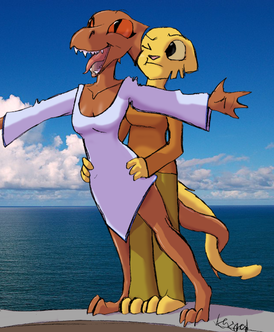
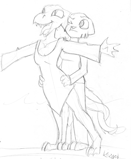
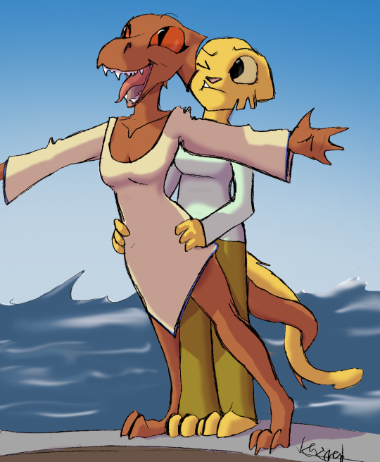
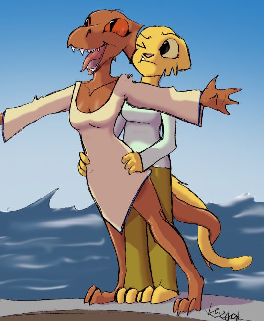
That is the question. Yesterday I felt like doing yet another color job, and I came across this sketch by Kazerad as a commission for Rick2Tails. I didn’t ask Rick if I could color it, but I feel like I know him well enough to know he’d be fine with it – and Kaz is certainly fine with it.
Now first, let me go off on a rant about coloring scanned sketches. Don’t. That’s my rant. I’m not ragging on Kaz here at all, but dammit it’s hard to get rid of all those extra lines! On the good side, you get so MANY lines to choose from – it’s kinda of a Roll-Your-Own sketch. Don’t like the curve of her thigh? Choose a different line! I mean, look at those intertwined tails! Quill magically has two different end-tails! 🙂 But that’s my problem. If I really wanna color a pencil sketch, there’s an hours worth of cleanup work to even get started!
But I really like this one because I honestly think it’s the only Kazerad drawing of a HAPPY Quill-Weave in existence. And, let’s face it, there’s some pretty seriously implied shipping going on here between Quill and Katia. Granted they’re about to go down on the Titanic but still…
Okay, but here’s the real question. A while back I did that sunbathing Quill and put lots of shiny highlighting on her. I liked it. A lot. So then even when I did the Pilgrim one I kept the shiny highlilghts.
Now, I’m afraid I’ve probably taken it too far. And that’s the Q. I know from past experience that my Tumblr readers don’t talk back much. That’s okay. I’ll post this elsewhere too. But I’m honestly wondering if I’m taking the shiny too far. (And breast emphasis – I already know that. But that’s something I’ll just have to live with.)
So, here it is – without the shiny. This is not finished – I made sure to keep all clothing colors change-able as I’m not convinced I like those either. And the water is horrible. But BESIDES that, is this better without shiny highlights:
Or with the shiny bits:
Of course, I’m leaning towards ‘with’ but that may well be just me. If I’m overdoing it, I would actually like to know!
Drawed by Kazerad, color and shitty background by me.
I started to second-guess myself on the shiny hussy Quill-Weave highlighting, but then I said WTH. It’s just for fun after all, right? I think that Bikini-Quill where I made her all shiny has somehow stuck, so I’m making her shiny here too.
But really, the pilgrim Weedum-Ja is being pretty hypocritical here even for a pilgrim! I doubt they’d approve of the gaudy gold headfin rings, and I KNOW they wouldn’t stand for the cross-dressing!
I was thinking about making Quill’s dress a sensible grey, but your eye can only handle SO much grey,black and white and I liked it better in pink. So QW gets to wear a nice pink dress. With frills. Don’t be upset Quill, what does that cross-dressing Weedum-Ja know anyway?
(Both characters technically copyright of Bethesda in Oblivion, though of course the redesign by Kazerad in Prequel Adventure. Also, if Kaz can be believed – and on this I think he can – Weedum-Ja IS a Pilgrim class in-game. So, nice little flip on the Pilgrim thing there.)
Quill-Weave sunning herself on a rock. I really liked Ciderward’s “where did the summer go” last bikini pic, so when Johnny Cheesedog scanned and posted this a while ago, it was just a matter of time before I got my sweaty claws on it.
Original:
by Kazerad commissioned by Johnny Cheesedog:
Extra Crispy:
After I colored it and made her all sweaty and hot. I think I may need to find more QW to make sweaty and hot again. Damn that calendar, I’ll miss sweaty and hot!
And what do you know? It’s not even Questionable!!!
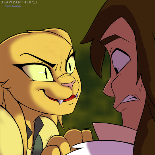
My favorite of this set by far. How can I help it with that expression? Anyway, another Satasha comission by DrawPanther. Then colored by me.
ORIGINAL:
And then after adding flat colors…
A bit of major shading and a background thrown in…
Highlighting doesn’t do quite a much here since the eye-lights were really already in the original (though I added some more anyway!)
That’s it. BTW, at some point I obviously accidentally pulled the shade layer down a few pixels – note the outline at the top of her head. However, I liked the result so I left it.
But one more change. Both Sashimi and the artist had teeth in mind behind Rajirra’s fangs instead of a tongue. I dunno, I kinda like the tongue but…
Oh! I posted this on the wrong blog too! Well, no problem there. A quick Reblog from the other site and PRESTO! Good as new.
Sorry – posted this on the wrong blog the other day. But this does give me a chance to correct the teeth/tongue thing. (I dunno, I still like the blood red tongue myself, but if the artist had teefers in mind, and the commissioner had teefers in mind, then teefers it shall be!)
Another color job. Drawn by DrawPanther, colored by your friendly neighborhood Draggy.
So, we’ll dive right in. Here’s the original from DrawPanther:
Pretty damned good. Sometimes I’m REALLY not convinced me coloring these things is an improvement. But we’ve always got the original I guess regardless so it’s not like I’m RUINING them.
So, first come flats, then shade, then highlights in my method. Flats:
I’d watch that cartoon! Shading time though, and also I threw in an admittedly bad background.
And finally, with highlighting. And I think this is the first one I’ve ever “signed”.
DrawPanther suggested it, so… Color by Bluedraggy.
Now, I did like this one but I gotta be honest, it’s the NEXT one I really really love! You’ll see why when I get it done in a few more days.
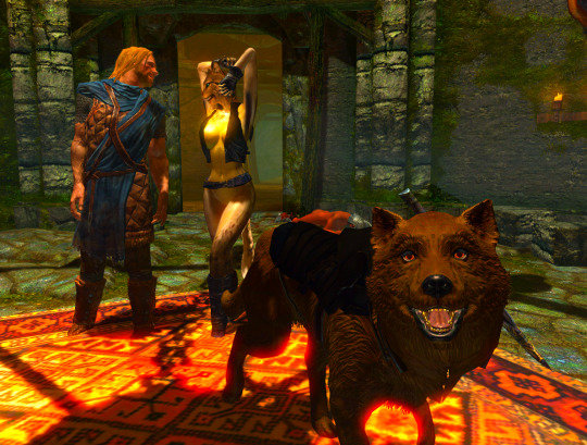
Yup, it’s time. I got Skyrim working well enough, got all required mods in. I also made two mods of my own. One is Slutcat’s vest. The second is a modification to Sworddog’s armor. (removing lots of it).
I THOUGHT I’d managed to get two more swords attached to Sworddog’s armor, but alas they didn’t show up in-game. I’ll have to work on that, but I always knew this was going to be haphazard at best.
If you happen to be unable to tell, it’s completely NSFW. I don’t emphasize the nudity but I don’t hide it either. I created a new blog specifically for it. If you don’t like NSFW stuff, you know what NOT to do, right?
2 posts up now, the 2nd with new screenshots. I point to the archive so you can read whatever one you’re up to. The first post was – but for FurNut’s drawing – all text. Second has plenty of screenshots though.
Once I switched back to Skyrim from Skyrim Special Edition, the rest was easy. I came across an open vest but had to do a lot of mods (it was long sleeved AND had pants AND the internal body wasn’t complete once I got rid of the pants via transparency. Also I messed with CBBE Bodyslide and Outfit Studio (Outfit Studio for the first time ever) to adjust the result to fit a custom bodyslide body. Then I started on Sworddog.
Her armor was actually pretty easy. I’d already modded it to remove most of the annoying stuff. But I tried to add 2 more swords to her armor and, though it shows up in Nifskope, they don’t show up in-game. I’ll keep working on that.
Then it was just a matter of getting screenshots. I didn’t shy away from anything obviously – just used the best that I had. So now I’m off to send her through the tunnels with Ralof and see what further mischief she gets herself into.