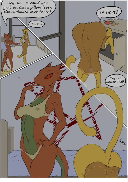
Oh Sentient Socks, where have you gone? Oh, he wasn’t the finest artist doing Prequel fanart, but in my opinion, he may have been the funniest. But he’s disappeared and, I fear, forever. Here’s one of his best that I decided to color.
First, yeah, Quill’s hands are too small. Okay. Let’s move on. That’s not the point. And BTW, I get about as NSFW on this as I could, so if that’s too lewd, don’t look farther! I’ve got lots of “in progress” pics, but I’ll just jump to the finale so you don’t have to go through them all if you don’t want.
Okay, that’s where we’re heading. Might be overworked but wth. I don’t get paid for this shit. 🙂 First, we have the base colors:
And yeah,the clothes aren’t colored yet. Why? Why, TRANSPARENCY my boy! No, there’s no reason whatsoever that their clothes would be in the slightest bit transparent. Well, no reason besides my own interests… Next up, background base colors.
Working on background colors now. That scratchy red star thing was a beast! The rest are just base colors, and I wanted to make sure the wall was a different shade from the floor. Let’s get some clothes on though.
Okay. There. Clothes. Transparent Clothes. And yeah, naughty bits – even for Katia if you look close at the top left frame! These are actual transparent layers too. I can remove the transparency if I want. But I’m a perv. Time to turn on the light.
I figured a single light, orange-ish shaded. A single candle or lantern most likely so the light’s going to be pretty sharp. I loved how QW turned out in the light. Actually I’m literally painting light here rather than adding shade as usual, because the whole piece was a bit dark. How to add light? Well, I chose to go with Color Dodge layer anyway.
Here I’ve added some shading. Also notie the shadows in the top left and top right frames. Those are new. Followed a tutorial to figure out how to do them properly. Now add some shiny and that’s about it.
The above image is ALMOST like the final version, but in the above image the clothes are opaque. You may get the form of a lizard nipple, but you don’t get to peek at anything underneath! 🙂 Told you they were adjustable transparency!
Anyway, that’s what I’ve been working on the last couple days. Like I say, it may be overworked, but I did learn some new techniques and hopefully getting better at older ones.
I like Sashimi. No, not the food – the Prequel fan that’s obsessed with Rajirra. It would be easy to obsess over a character in secret. Sashimi is open to it, and like Rick2Tails, has to put up with shit for it. I find I like Sashimi’s Rajirra too. But she’s kinda been expanded so much that the original character is kinda lost in there somewhere.
Anyway, Sashimi commissioned Guoh to draw another scene from his fanfiction. Here it is, by Guoh:
It should be no surprise that I colored it. Jeeze, what a start! So I decided to do my best work on this one. I’m at 19+layers in my .psd file and it takes a good 2 minutes to convert it to a .png. Whether all that work is worthwhile is up to you, but I like it and – though as of this writing, Sashimi hasn’t seen the end result yet, he’s seen a couple of preliminaries.
Alright, let’s start with Flat Colors…
Yeah… okay. Nice enough I suppose. BTW this was the main color ref:
So… wood. There’s lots of wood in that picture. So I tried an experiment. This may have been done by plenty before me, but I at least came up with it on my own. I thought – what if I add some Noise, then Motion Blur it in the direction of the wood grain? I think it turned out pretty good actually!
As for the sky, that’s not a photoshopped real sky. Its a 4-color gradient, but I did nab the colors from a real photo. The scene is supposed to take place somewhere around dusk and I kinda liked the mood. But notice Kazerad’s colors above, in particular the pale under-colors. He shades them with a darker yellow- almost orange. That’s not what I’m used to doing… so let’s give it a shot!
Now I’m skipping over a LOT here.At the default res it’s a bit hard to see, but I’ve shaded the hair to be more like hair, put a lot of furry-edging on, withstrained my natural urge to make everything out of rubber (there’s some ‘sheen going on there, but for me I kept it subtle). Now just some shading of the wood and I’ll call it done. The yellow shade on the dress does look pretty good though!
It may just be my conceit that I think it looks much better at higher resolution. I don’t know why Tumblr refuses to link automatically to the higher resolution images that ARE stored in Tumblr. Bandwidth conservation? Anyway…
And there you have it. Sashimi’s Rajirra. He let me read a bit of his fiction to see what was going on in this scene. Trust me when I tell you that Rajirra is NOT just getting up from pissing in the bucket while reading a scrolled-up newspaper. 🙂 She’s accepting a reward for some heroic deed. The bucket is there for a reason and the scroll is too. Until his fanfiction is public, that’s about all I can say.
Anyway, hope you liked it. I may still have issues, but at least I put real time into this one and tried to do my best. For Sashimi’s Rajirra. (Not sure that I’d do the same for canon Rajirra!)
Rick2Tails uploaded a sketch by Kandlin ( http://kandlin.tumblr.com/ ) of Quill-Weave in a bikini with pie. Specifically:
Now granted it’s just a sketch, but I wanted to color it anyway and I don’t think Kandlin would mind. I know Rick wouldn’t because I asked him first!.
So here it is.
It’s getting more rare that I can post things here in bdprequel blog that aren’t nsfw and are Prequel related, that I’m glad to have something new to post
This is something Kazerad drew for Rick2Tails quite some time ago. I was looking for something to color since I’d not done any of those for awhile and thought this was awfully cute. Porcupine-Dodger peeking at a Rick2Tails sketchbook apparently (though I thought it was a Elder-scrolls version of the Kama Sutra. On second thought, there’s probably not a heck of a lot of difference.)
First task, darken up the lines and flat colors:
…throw in a background and shading…
Then I shiny-ed her up a lot to make her looks more sweaty, and of course the standard eye-highlights. So final version came out like this:
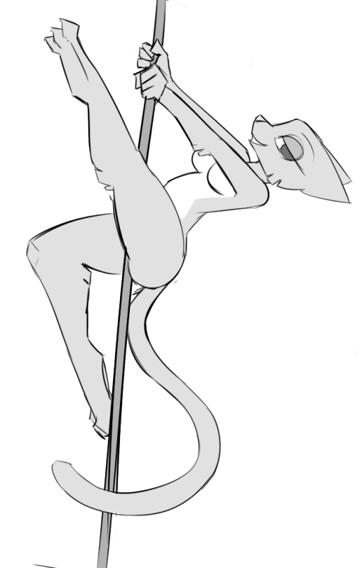
Something about that title just suggests a rather specialized Barbie doll. “Kids! Get you’re Pole-Dancing Katia now at Toys-R-Us!” No, this one won’t be on sale there I’m afraid.
However, if Quill-Weave mutilating a pumpkin with a knife while clothes-less was okay, then this just MIGHT be too. Or it might not. But this is gonna be a long post anyway, so if you just wanna get to the good stuff, you can just scroll down to the bottom.
But let me sidetrack a sec. I really like some things about Tumblr, mostly the ease of posting and the way it auto-splits images into 3 different resolutions (or more). And ESPECIALLY that those images are publicly accessible directly. That may not be the case forever, but it is for now anyway. Sure they rename them weird, and they’re constantly changing HOW they store them, but still it works and is easy to upload. What’s the point?
Take this sketch by Ciderward as an example…
Yeah, it’s lewd. I hope you like it because you’re gonna see LOTS more of it on this post. But as to Tumblr, that image up there is found at URL 78.media.tumblr.com/978a937056298758e4cb31ec3dcb31a1/tumblr_inline_ozo4mvza7G1sn6wro_540.png (right now. It can actually change!) Notice the 540.png at the end. Well, you can change that manually to 1280.png and get a higher resolution (if the original is bigger than 540px wide). Which is cool. But you can also find the original (raw) version by doing this;
Change the 78.media at the first of the url to data, and change the _540.png at the end to _raw.png
Doesn’t make a difference with Stripper Katia but it gets you the original, unmolested resolution. You might want it if you REALLY like Stripper Katia. So… now, on to the good stuff…
Cider drawized it on a recent stream. I was asked to color it and to say I did is probably an understatement. I went wild on it. I do feel bad though because I forgot who originally commissioned it! But honest he did ask me to color it!
So first, as usual, I added flat colors. Not much to that this time:
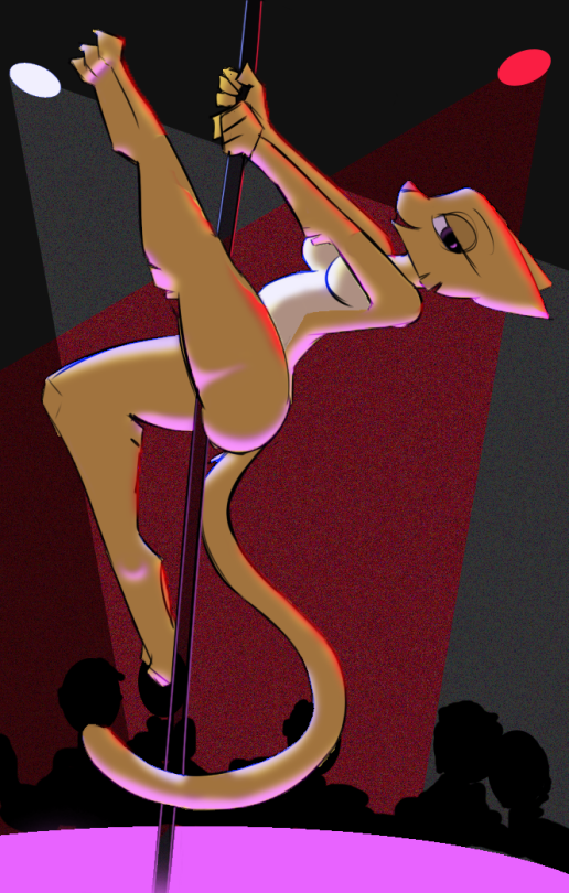
Which is nice. But then I normally move on to shading. Where’s the light source gonna be? Wait… Light source? On a Stripper Cat? Why, there would be MULTIPLE light sources. This was going to be interesting. So, put her on stage! (lighted purple stage that is)
Now suddenly there’s potential here! Lights! Camera! ACTION! Let the shading-beast LOOSE!
Nice! (or not. But I thought ‘Nice!’) Time for highlights and an audience!
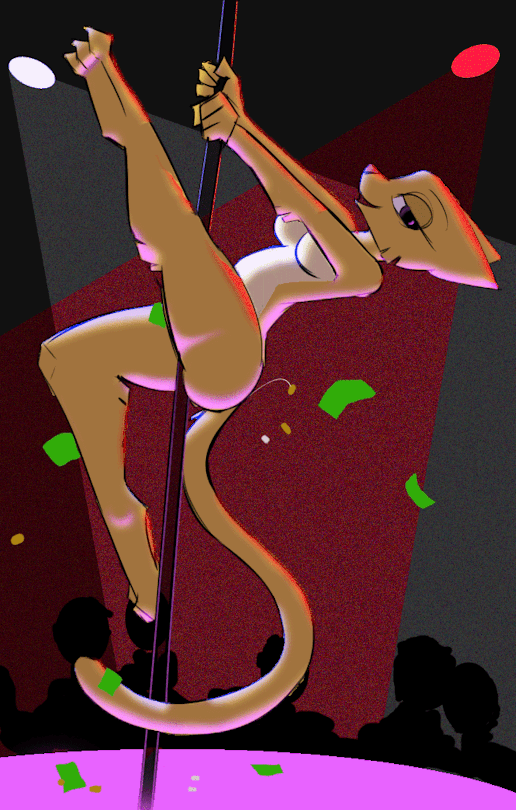
I was working on this while also on a FurNut stream and threw it out there for comments. FurNut himself drew one thing that was obviously needed to make it accurate, pointing out that really since Katia is from Oblivion, the coins were more likely than bills. After a few tweaks I ended up with this. By the way, you can blame Sashimi on the coin that’s bouncing off her ass.:)
FINISHED? WHY HELL NO! I’ve got multiple light sources here! I can turn them on and off! I’ve got a damned animated GIF I can make out of this!:
And there you have it. Stripper Katia – Fully Loaded.
Think it will pass the Booru rules? Na. Probably not. And personally I prefer the non-gif one a little more. But a bit of easy ‘animation’ does spice things up!
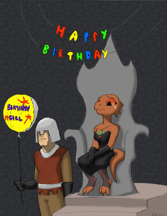
I still do things sometimes. Commission from Kaz that I colored, though I think I just asked Evil Quill Weave’s Birthday Party. Leave it to Kaz to turn it into a pathetic scene of sadness and pathos!
Though it could be interpreted as tears of joy at Faceless Mook throwing her a birthday party at all. (Though knowing Kaz, that’s unlikely. More likely she realizes how pathetic that she had to order her minion to throw her a party.)
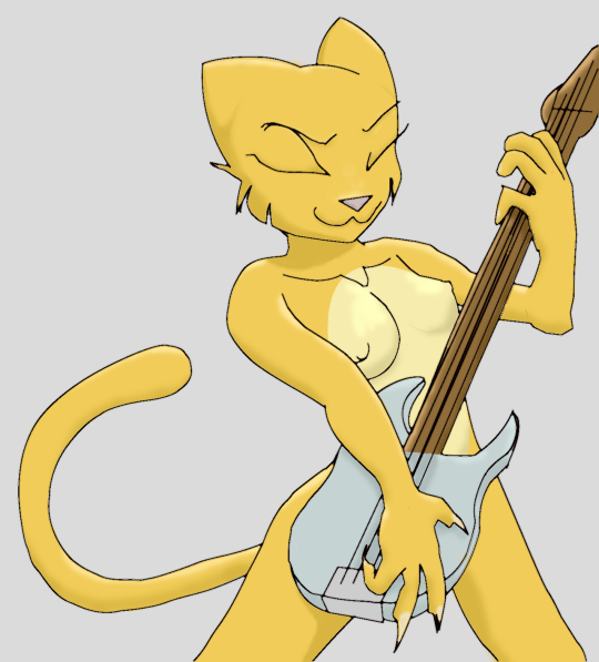
Can you separate a name like “Weedum-Ja” like that? Well, anyway, I did. Here’s our Fourth band member, Weedum-Ja. She’s the one that dragged S’thengir into the band. I call her “Six Fingers” because Kaz tends to draw Argonians with only 3 fingers per hand.
So here’s she is tickling the ivories as they say. But this time I won’t post the layers. Haven’t got a lot to say about it, though I do like her!
Ok, I finished all I plan to do on my Katia bass player. (till I get the all done and do one massive full-band image!) If anyone feels like uploading this to the fanart booru, be my guest. I’ll include a link to a high res image at the bottom here that would be best. E621 is fine too. HOLD OFF on that! Kaz has a suggestion to improve the line art and I’d love to see if that will make it better!
I just think I’ve exhausted my supply of inappropriate uploads on the Fanart booru to do it myself. I tried to keep it within Questionable bounds, but I don’t feel like taking the risk myself.
This is not a tutorial, it’s just a blog of what I did and I’m a beginner at these things for sure! But since Photoshop let’s you do layers, here’s all my layers and what they were intended for.
First, of course, Kaz’s original – scanned.
Next, I drew lines over it.
During one of Kaz’s streams, I saw how he was doing it, or at least I thought I did. Of course, he did it like lightning fast but I think I got the gist. I draw a path, curving the path as needed to at least come close to the primary lines.
The lines I drew were much fatter than this layer indicates – I thinned them down later. Once a path is in place, you use Stroke to draw a line over it at the color/size that the current paintbrush is set for. So here’s that stage (again, these lines are thinner than what I started with. I just thought the ending lines were too think so I thinned them down):
Then I put in the solid colors. I used the fill bucket for large areas, but then went over the edges with a small brush so there’s no edge weirdness. That took a long time to say the least. But I learned the necessity of that a while back when doing another color-job some time ago.
That’s where I left it yesterday. This morning I watched some tutorials and looked at the biggest repository of Katia fan art there is. (No silly, not the fanart booru… e621!) For research purposes only of course! Please be gentle – shading is a dark art to me and a lot of it is guesswork, but here’s what I finally came up with. (I tried to keep the shading modest till I get more confident with it)
And then the easy part – found a background ‘stage’ and stuck her in it:
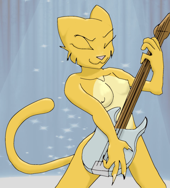
BUT then Kaz suggested a tapering method of improving the line art. This is new and updated here. Mostly lines that end are now tapered rather than hard-ended. Mostly around eyes, mouth and boobies. Also a layer was causing background to be lighter than intended.
And that’s it for Katia. I plan to do the others too of course, and eventually put them all on stage with Katia.
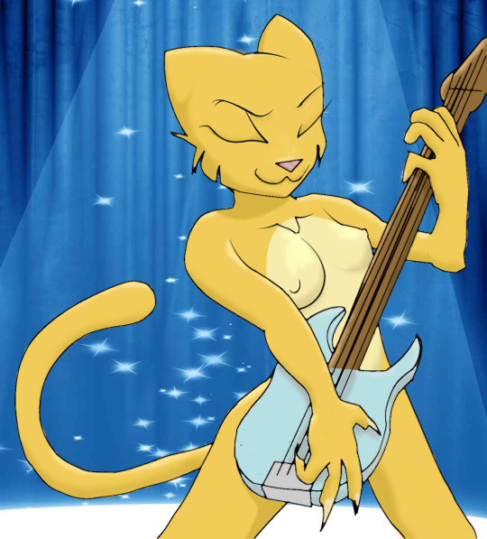
Reblogging my own – is that a shitty thing to do? But doing so because Kaz suggested an improvement that I think warrants the reblog. New image here and high res is improved as well.
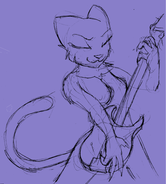
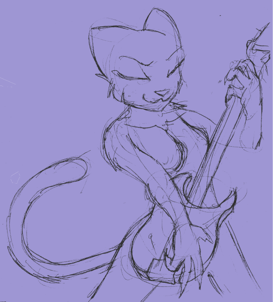
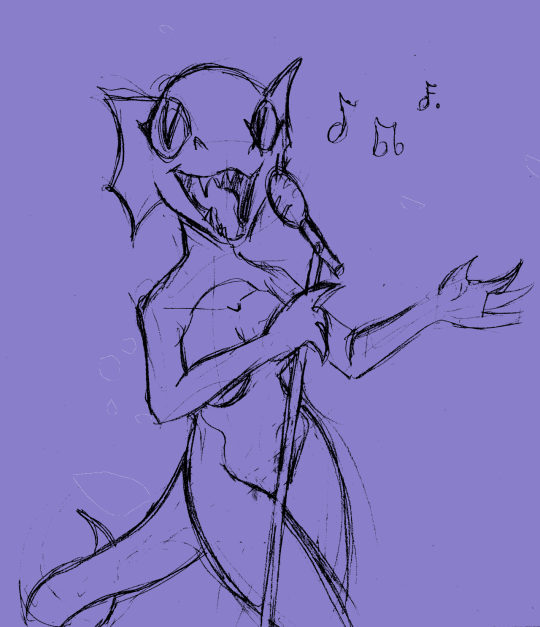
I think I’ll kinda document my work on some of these Kazerad things he sent me. I’m INCREDIBLY slow at this stuff. Photoshop is just too complex for my simple thinking. I usually just do stuff like this in Paint.net but this needs more tools, so I’m learning as I go along. Here’s Day 1′s progress on Just One image!
The original from Kaz. (I added the blue background because white just hurts my eyes too much, and did some basic cleanup to make it easier to find the lines that are important)
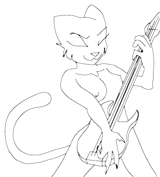
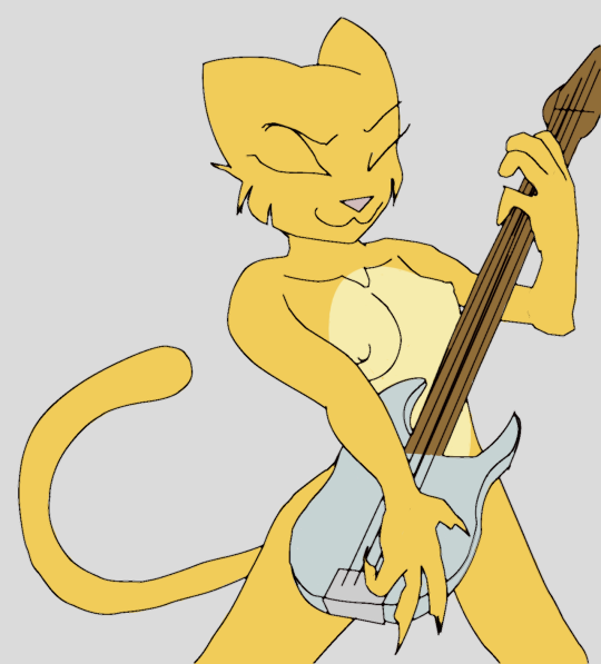
And here’s my lineart and basic flat colors:
Still got a long way to go – and I’ll not emphasize those nips any more than they already are. Yeah, kinda NSFW but not extravagant.


