Sentient Socks Homage

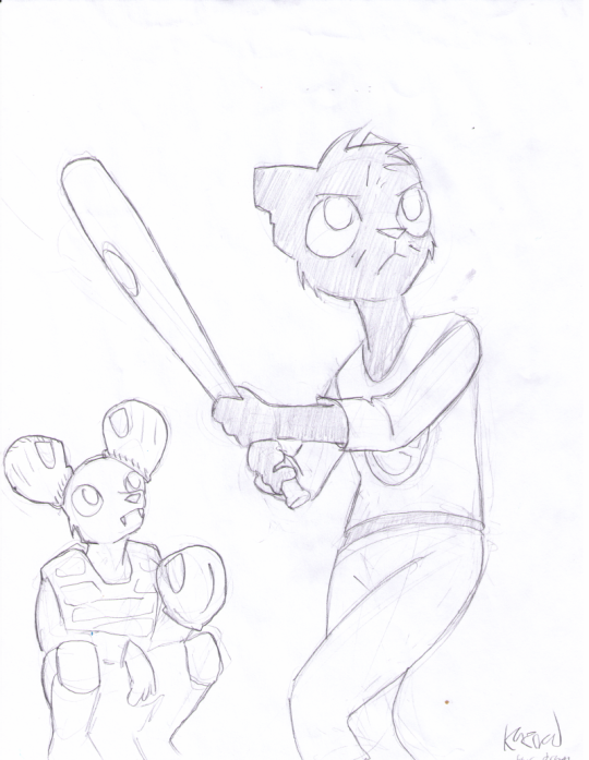
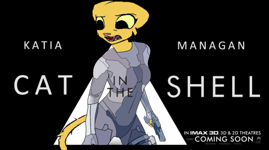
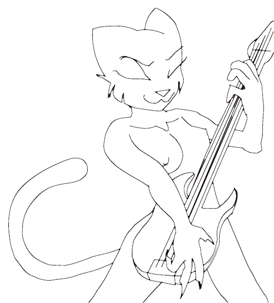
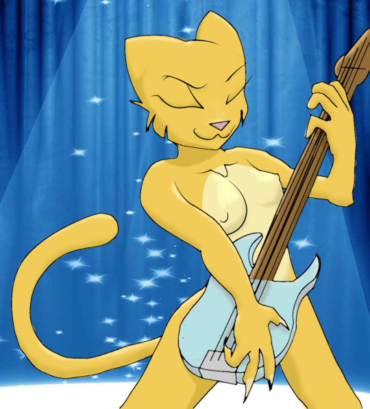
Oh Sentient Socks, where have you gone? Oh, he wasn’t the finest artist doing Prequel fanart, but in my opinion, he may have been the funniest. But he’s disappeared and, I fear, forever.  Here’s one of his best that I decided to color.

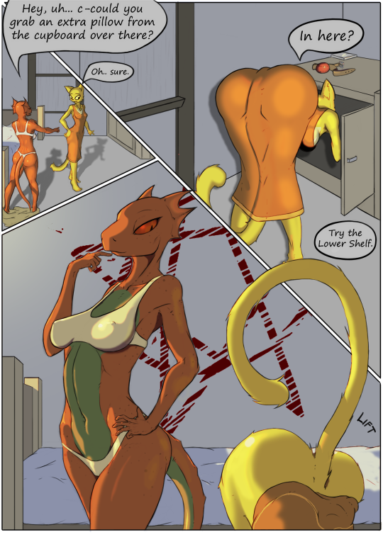
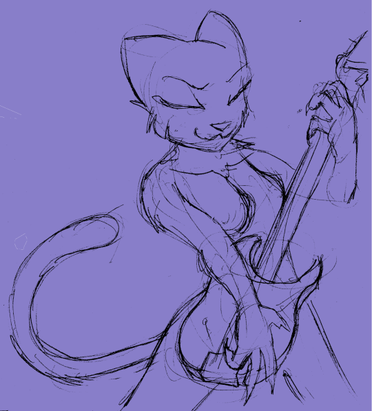
First, yeah, Quill’s hands are too small. Okay. Let’s move on. That’s not the point. And BTW, I get about as NSFW on this as I could, so if that’s too lewd, don’t look farther! I’ve got lots of “in progress” pics, but I’ll just jump to the finale so you don’t have to go through them all if you don’t want.

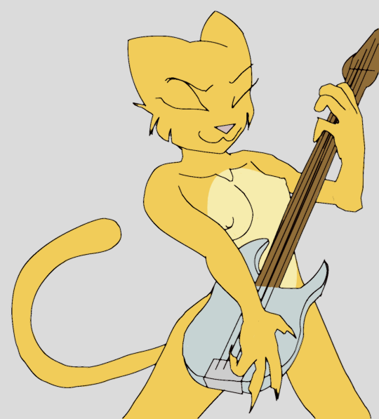
Okay, that’s where we’re heading. Might be overworked but wth. I don’t get paid for this shit. 🙂 First, we have the base colors:

And yeah,the clothes aren’t colored yet. Why? Why, TRANSPARENCY my boy! No, there’s no reason whatsoever that their clothes would be in the slightest bit transparent. Well, no reason besides my own interests… Next up, background base colors.

Working on background colors now. That scratchy red star thing was a beast! The rest are just base colors, and I wanted to make sure the wall was a different shade from the floor. Let’s get some clothes on though.

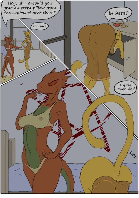
Okay. There. Clothes. Transparent Clothes. And yeah, naughty bits – even for Katia if you look close at the top left frame! These are actual transparent layers too. I can remove the transparency if I want. But I’m a perv. Time to turn on the light.

I figured a single light, orange-ish shaded. A single candle or lantern most likely so the light’s going to be pretty sharp. I loved how QW turned out in the light. Actually I’m literally painting light here rather than adding shade as usual, because the whole piece was a bit dark. How to add light? Well, I chose to go with Color Dodge layer anyway.

Here I’ve added some shading. Also notie the shadows in the top left and top right frames. Those are new.  Followed a tutorial to figure out how to do them properly. Now add some shiny and that’s about it.

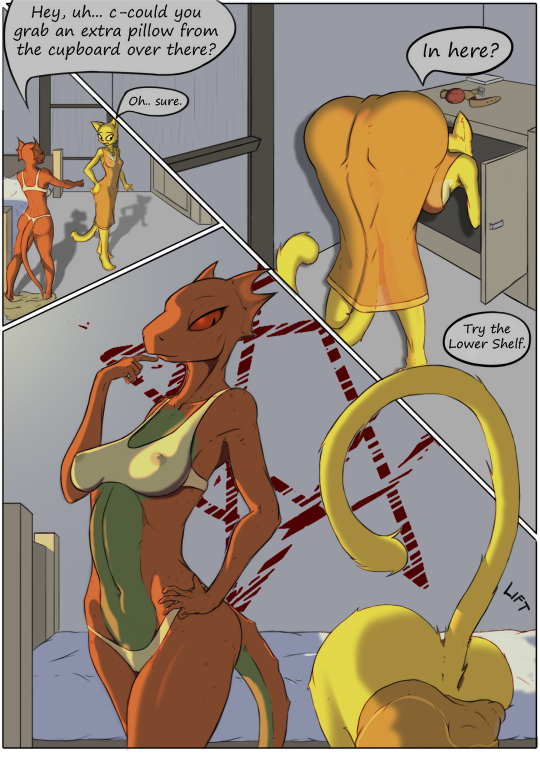
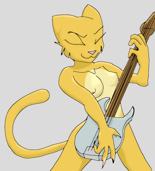
The above image is ALMOST like the final version, but in the above image the clothes are opaque. You may get the form of a lizard nipple, but you don’t get to peek at anything underneath! 🙂 Told you they were adjustable transparency! 

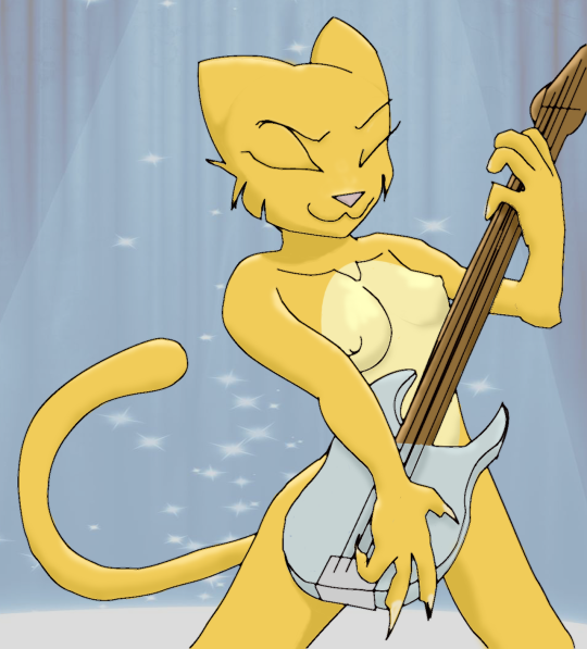
Anyway, that’s what I’ve been working on the last couple days. Like I say, it may be overworked, but I did learn some new techniques and hopefully getting better at older ones.

Gregg and Mae at Bat

I deleted my prior post because I made it when butthurt and that’s always a bad idea. Instead I’ll repost properly. Months ago Kazerad was doing a stream and he was sort of randomly doodling something. He said it looked like somebody holding a bat. 

I suggested – well, Mae from Night in the Woods might be appropriate! And I think as he was drawing it, as a joke I mentioned that Gregg might be a good catcher. So he drew this:

(If you’ve not played NitW – shame on you. But Gregg has a scene where he puts cups on his ears. Kaz came up with the gloves on his ears. Nice!)

So I was looking for something to color and decided to do this one. One thing I decided right off though was that I wanted to “ink” it. That is, redraw all the major lines and work off of that rather than the sketch. Watched a video or two and then did this:

The point being that by doing so I don’t have to try to clean up the reference and ‘scratchy’ stuff. That took longer than you might expect, but it did give me a good base to start from. Flats of course….

I’m on a discord and I posted it at that point just to see what they thought. Pocky asked if I was going to do her bright yellow mouth. I’m like, “What?” “Yeah, her mouth is bright yellow.”  Now this I had to see:

Oh! The LINES are bright yellow. Because she’s so dark. I even lightened her up a bit anyway. But… Hmm… What would that look like? It would look like this!

Hey! That’s not that bad! And provides at least a slighly more ‘canon’ look to her So yeah, we’ll do that?  I did one background but realized after I’d done it that the angle was wrong. It made Gregg look like a little tiny guy rather than the perspective thing. So I redid it and came up with this (eventually!)

The yellow blocks are supposed to look like chairs. Yeah, well… So shadows, highlights and some gloss later, I got this finally:

The eyes though… I dunno. I felt like they really needed black pupils, so i added those in my final cut. Also I realized I couldn’t post it on Kaz’ Prequel fanart booru because there’s nothing Prequel about it. So in addition to the black pupils, I also added Katia and QW as spectators. I will be the first to admit it wasn’t hard to do. 

So that’s it right? Not so fast. The image was removed from the Booru as not related to Prequel enough. I wasn’t pissed at the moderator, but I was pissed. I complained long and loud to some friends. (and the Tumblr post.) I updated everywhere I had posted to leave out K&QW. If it’s not Prequel enough for the Booru, I reasoned, I’m not going to go giving free ‘advertising’ either. And I railed about how some that were accepted took less effort than mine! And I got this idea bout drawing a terrible Katia on blue-lined note paper in ink, taking a picture of it in bad lighting and posting it to the Booru, making sure I spent less time on it that I had inserting QW and Katia into mine.

But eventually I calmed down. I don’t get butthurt a lot, but I do occasionally. I came up with a better plan. I’m going to write an essay, tited “The Problem of Moderation”. I have some experience in the topic. The point is honestly to get Kaz to at least reconsider the policies there. But it’s his show, I’m just in the audience. But maybe if I present my case reasonably and calmly, he might at least consider it.

So that’s the whole story. And I want to emphasize again that I NEVER was mad at the Mod who deleted it. I was mad at the policy itself. And the essay will explain why. Being a mod is a thankless, no-win job No one should be angry at the moderator for doing that job.

Katia and Blue Dragon

I’ve had the handle “Blue Dragon” or some variation of it for literally decades. Since people called them “handles”! But in all that time I’ve never, ever had a real avatar/OC. A few weeks back during a stream I commissioned Kazerad to draw “My Weird OC”, describing him as a bit like Dino from the Flintstones.

He’s about the farthest thing from a fearsome dragon as is possible to get. Kaz came up with this, which I colored and shaded today. It’s a simple thing, but having my own Weird OC is just… weird! I like him a lot! Though I identify somewhat as a Furry I guess, I’ve never really had a desire for a personal OC like this, but now that I’ve got one, I’m probably going to have to change my various avatar pics.

Okay, enough blab. Here’s the image:

image

Blue Dragon getting underfoot of a cat, instead of the other way ‘round.

Mostly I’m just doing these for shading practice which is kinda fun. But poor Kazerad. He keeps trying to de-emphasize Katia’s boobs, and then I come along with my shading and give her DDs. I’m a bad dragon. But happy!

Oh, and here’s Kaz’ original sketch:

image

Cat in the Shell

A couple of streams ago, Kaz closed down to go see Ghost in the Shell. It had been a couple days and I was really curious to see if he liked it. But I couldn’t ask in Comments as it’s totally non-related. So I did this thing on the fanart page instead.  Wasn’t mean’t to be art, just a silly thing:

But then Protofun did a less pasted-on looking thing:

So that’s what’s on the Booru now. 

And just for completeness, the original:

Scarlett Johansson is pretty and all, but suffers from a dreadful lack of tail. Still, I am guilty of species washing since the original anime obviously intended for the character to be tail-less.

Fanfic image 3 of 5

Frankly, I was not happy with that last one.  I’m going to leave it as-is, but I felt it did a disservice to Kaz’ original sketch.  This time I’ve got a pretty important image I’ve been working on, and it was important I get it right.  So rather than draw lines over Kaz’ original, I just cleaned it up a bit and used his sketch as the line art layer.

Here’s the original:

This is, in my opinion, one of the best sketches of Katia and QW I’ve seen because I asked him to age them up a lot. Granted Quill would be the really tough one as, if lifespans are constant across races, she’d probably be dead by now.  But I’d prefer to think Argonians live longer, whether or not that’s true in TES lore.  Anyway, both are instantly recognizable but instantly elderly too, and they’re not wearing their “standard” outfits.  Pretty awesome work IMHO.

I felt it very important I not botch this up like the last one. Here’s the end result. I don’t know that it’s as awesome as the original or not, but by keeping his linework I think it’s definitely a big improvement over the last one I did!

In the fanfic, Katia is nearly blind here and is dictating a letter that Quill is helping her write to someone. Pretty crucial image as it sets up the whole thing.  Anyway, I like it one hell of a lot better than my last one.  I think I’ll stick with this method.  2 more to do before I release the story.

Hey! I just thought of a caption!  The Elderly Scroll.

Aggy “The Banshee”

He’s the ghost with the most, so cool he’s cold, so laid back he should be laying down, it’s Aggy wailin’ on the sax in the Not-Yet-Ready-For-Clothing Players band!

So I started with this from Kaz:

First thing I started on this, I felt it might be trouble. Aggy just isn’t very defined and with the sunglasses on (that I suggested btw) there’s even less… there. But I charged ahead anyway…

I accidentally put some color work on the line layer.  I seem to do that sort of thing I could probably fix it but it doesn’t matter really. But you can probably see here what I meant. There’s just not a lot TO Aggy. I chose to interpret some lines Kaz drew at the top of his head as wispy hair. Not sure it was meant to be that, but I ran with it.

Then I did the flat color. Aggy was no problem – he’s blue. Duh… but that sax… Oh did I underestimate that!

I tried LOTS of methods on the sax, none of which looked good.  Gradients, complex brushes, nothing looked good at all.  Finally I just took a look at a picture of a sax and copied some colores.  That one reflection inside the horn is the best thing I did. The rest looks meh. But at least it’s recognizable as a sax I think.

Finally I decided I would do highlights on a ghost.  It would look weird next to the others if I didn’t.  Though honestly I didn’t spend a lot of time on it. Then opened up the transparency a bit so you can see a bit through him.  I do like how the sunglass highlighting came out.  With no eyes to work with, it was nice to get that in at least.

And that’s it.  Aggy’s in the band!  Only one left – Nah, the vampiric guitarist (with full nipplage! Yes, Kaz didn’t cop out and hide her boobs behind anything!  So who am I to do anything less?)

Weedum “Six Fingers” Ja

Can you separate a name like “Weedum-Ja” like that? Well, anyway, I did. Here’s our Fourth band member, Weedum-Ja.  She’s the one that dragged S’thengir into the band. I call her “Six Fingers” because Kaz tends to draw Argonians with only 3 fingers per hand.

So here’s she is tickling the ivories as they say.  But this time I won’t post the layers.  Haven’t got a lot to say about it, though I do like her!

Katia Bass Final

bdprequel:

Ok, I finished all I plan to do on my Katia bass player. (till I get the all done and do one massive full-band image!) If anyone feels like uploading this to the fanart booru, be my guest.  I’ll include a link to a high res image at the bottom here that would be best.  E621 is fine too. HOLD OFF on that! Kaz has a suggestion to improve the line art and I’d love to see if that will make it better!

I just think I’ve exhausted my supply of inappropriate uploads on the Fanart booru to do it myself. I tried to keep it within Questionable bounds, but I don’t feel like taking the risk myself.

This is not a tutorial, it’s just a blog of what I did and I’m a beginner at these things for sure! But since Photoshop let’s you do layers, here’s all my layers and what they were intended for.

First, of course, Kaz’s original – scanned.

image

Next, I drew lines over it.  

During one of Kaz’s streams, I saw how he was doing it, or at least I thought I did. Of course, he did it like lightning fast but I think I got the gist. I draw a path, curving the path as needed to at least come close to the primary lines. 

The lines I drew were much fatter than this layer indicates – I thinned them down later. Once a path is in place, you use Stroke to draw a line over it at the color/size that the current paintbrush is set for. So here’s that stage (again, these lines are thinner than what I started with. I just thought the ending lines were too think so I thinned them down):

image

Then I put in the solid colors.  I used the fill bucket for large areas, but then went over the edges with a small brush so there’s no edge weirdness. That took a long time to say the least. But I learned the necessity of that a while back when doing another color-job some time ago.

image

That’s where I left it yesterday. This morning I watched some tutorials and looked at the biggest repository of Katia fan art there is. (No silly, not the fanart booru… e621!) For research purposes only of course!  Please be gentle – shading is a dark art to me and a lot of it is guesswork, but here’s what I finally came up with.  (I tried to keep the shading modest till I get more confident with it)

image

And then the easy part – found a background ‘stage’ and stuck her in it:

image

BUT then Kaz suggested a tapering method of improving the line art. This is new and updated here.  Mostly lines that end are now tapered rather than hard-ended.  Mostly around eyes, mouth and boobies. Also a layer was causing background to be lighter than intended.

image

And that’s it for Katia. I plan to do the others too of course, and eventually put them all on stage with Katia.  

Here’s the promised link to a higher-res version:

https://68.media.tumblr.com/a756e45b6e282af19d23479f4aac5ea9/tumblr_inline_oj4edwQaGj1sn6wro_1280.png

QW is next!

image

Reblogging my own – is that a shitty thing to do? But doing so because Kaz suggested an improvement that I think warrants the reblog.  New image here and high res is improved as well.

Katia Bass Final

Ok, I finished all I plan to do on my Katia bass player. (till I get the all done and do one massive full-band image!) If anyone feels like uploading this to the fanart booru, be my guest.  I’ll include a link to a high res image at the bottom here that would be best.  E621 is fine too. HOLD OFF on that! Kaz has a suggestion to improve the line art and I’d love to see if that will make it better!

I just think I’ve exhausted my supply of inappropriate uploads on the Fanart booru to do it myself. I tried to keep it within Questionable bounds, but I don’t feel like taking the risk myself.

This is not a tutorial, it’s just a blog of what I did and I’m a beginner at these things for sure! But since Photoshop let’s you do layers, here’s all my layers and what they were intended for.

First, of course, Kaz’s original – scanned.

image

Next, I drew lines over it.  

During one of Kaz’s streams, I saw how he was doing it, or at least I thought I did. Of course, he did it like lightning fast but I think I got the gist. I draw a path, curving the path as needed to at least come close to the primary lines. 

The lines I drew were much fatter than this layer indicates – I thinned them down later. Once a path is in place, you use Stroke to draw a line over it at the color/size that the current paintbrush is set for. So here’s that stage (again, these lines are thinner than what I started with. I just thought the ending lines were too think so I thinned them down):

image

Then I put in the solid colors.  I used the fill bucket for large areas, but then went over the edges with a small brush so there’s no edge weirdness. That took a long time to say the least. But I learned the necessity of that a while back when doing another color-job some time ago.

image

That’s where I left it yesterday. This morning I watched some tutorials and looked at the biggest repository of Katia fan art there is. (No silly, not the fanart booru… e621!) For research purposes only of course!  Please be gentle – shading is a dark art to me and a lot of it is guesswork, but here’s what I finally came up with.  (I tried to keep the shading modest till I get more confident with it)

image

And then the easy part – found a background ‘stage’ and stuck her in it:

image

BUT then Kaz suggested a tapering method of improving the line art. This is new and updated here.  Mostly lines that end are now tapered rather than hard-ended.  Mostly around eyes, mouth and boobies. Also a layer was causing background to be lighter than intended.

image

And that’s it for Katia. I plan to do the others too of course, and eventually put them all on stage with Katia.  

Here’s the promised link to a higher-res version:

https://68.media.tumblr.com/a756e45b6e282af19d23479f4aac5ea9/tumblr_inline_oj4edwQaGj1sn6wro_1280.png

QW is next!

image

KatiaBlues 1

I think I’ll kinda document my work on some of these Kazerad things he sent me.  I’m INCREDIBLY slow at this stuff. Photoshop is just too complex for my simple thinking.  I usually just do stuff like this in Paint.net but this needs more tools, so I’m learning as I go along.  Here’s Day 1′s progress on Just One image!

The original from Kaz.  (I added the blue background because white just hurts my eyes too much, and did some basic cleanup to make it easier to find the lines that are important)

And here’s my lineart and basic flat colors:

Still got a long way to go – and I’ll not emphasize those nips any more than they already are.  Yeah, kinda NSFW but not extravagant.

Next, fingernails and beginning shading.